Stop buying paint that looks nothing like the swatch. Learn how lighting, undertones, and finish actually work so you can choose colors you'll love for years.
- May 8, 2026
AceShowbiz - You picked the perfect shade of pale gray at the store. It looked soft, airy, and sophisticated on that tiny cardboard rectangle. But now it's on your living room wall, and it looks like a bruised battleship. You're not alone. According to a 2022 survey by Sherwin-Williams, nearly 40% of homeowners regret their paint color choice within the first six months. The problem isn't your taste—it's that paint color is a liar. It changes based on light, room size, and even the furniture you already own. Let's fix that.
The Real Reason Swatches Lie to You
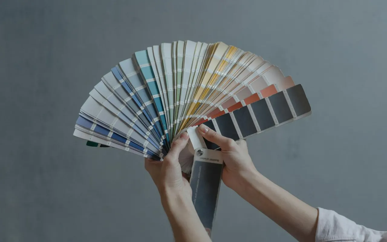
That little paper swatch you're holding is printed with ink, not actual paint. It's a rough approximation, not a promise. Paint manufacturers tweak colors for mass production, and the tiny swatch size means you never see how the color behaves across a large surface area. The result? A color that looks warm and inviting in the store can turn cold and flat on your wall.
There's also the issue of color perception. Your brain processes color in relation to its surroundings. In a well-lit store with white walls and neutral floors, a beige looks creamy. But in your north-facing bedroom with warm wood furniture, that same beige can look greenish. This is called simultaneous contrast, and it's why you need to test paint in your actual room.
Practical tip: Never trust a single swatch. Buy a small sample pot and paint a 2-foot by 2-foot square on the wall you intend to paint. Live with it for at least 48 hours. Look at it in the morning, at noon, and at night with your lamps on. If you still love it after that, you're safe.
How Light Shapes Your Color (And Your Mood)
Light is the single biggest factor that changes how paint looks. Natural light changes throughout the day, and artificial light adds its own color temperature. A north-facing room gets cool, blue light all day, which makes warm colors look muted and cool colors look even cooler. South-facing rooms get warm, golden light that makes cool grays look warm and warm colors look intense.
Artificial Light Changes Everything
Your light bulbs matter more than you think. Warm white bulbs (2700K) cast a yellow-orange glow that makes cool colors like blue-gray look muddy. Cool white bulbs (4000K) cast a blue-white light that makes warm colors like beige look flat. If you have a mix of bulb types in one room, your paint will look different from every angle.
Practical tip: Before you choose a paint color, decide on your lighting first. Swap all bulbs in the room to the same color temperature—either all warm (2700K) or all neutral (3500K). Then, test your paint sample under those exact bulbs. This one step will save you from a $400 painting mistake.
Undertones: The Hidden Colors That Ruin Everything
Every paint color has a hidden undertone—a subtle hint of another color underneath the main one. White paint isn't just white. It can have undertones of pink, yellow, blue, or green. Gray paint can lean purple, brown, or blue. Beige can look green or pink. These undertones only become obvious when you put the color next to something else, like your white trim or your sofa.
This is why two different "greige" (gray-beige) paints can look completely different in the same room. One might have a green undertone that clashes with your pink-toned floors, while another has a purple undertone that makes your yellow curtains look dirty. The only way to see the undertone is to compare the paint to a pure white piece of paper or a true neutral like a gray card.
Practical tip: When you're at the paint store, hold the swatch next to a piece of plain white printer paper. The paper will reveal the true undertone. If the swatch looks slightly pink, green, or blue next to the paper, that's your undertone. Choose colors whose undertones complement your existing furniture and flooring, not fight them.
Finish Matters More Than You Think
Most people pick a color and then grab the cheapest finish—usually flat or eggshell. But the finish (also called sheen) changes how the color reads. Flat finishes absorb light, making the color look softer and darker. Glossy finishes reflect light, making the color look brighter and more vibrant. A deep navy blue in a flat finish can look almost black, while the same navy in a satin finish will show its true blue undertone.
There's also a practical side. Flat finishes hide wall imperfections like dents and patches, but they're hard to clean. Glossy finishes are easy to wipe down but show every bump and brush stroke. For a high-traffic hallway or a kid's room, a satin or eggshell finish is the sweet spot—it reflects enough light to show the color well but doesn't highlight every flaw.
Practical tip: Always buy the same color in the finish you plan to use for your sample test. A flat sample will look different than a satin version of the same color. If you're painting a bathroom or kitchen, go with a semi-gloss or satin finish for durability, but test the color in that specific finish first.
The Room Size Trap: Why Dark Colors Can Make Small Rooms Feel Bigger
Conventional wisdom says light colors make a room feel bigger and dark colors make it feel smaller. That's not always true. A dark color can actually make a small room feel more expansive if it blurs the edges of the walls. When the walls recede into a deep, rich color, your eye stops seeing the boundaries of the room. The focus shifts to the furniture and the view, not the cramped walls.
On the flip side, a very light color in a small room can feel sterile and flat, making the room feel like a white box. The trick is to match the color's intensity to the room's natural light. A small room with big windows can handle a deep forest green because the light will balance it. A small room with no windows should stick to medium-toned colors, not pure white.
Practical tip: For a small room you want to feel bigger, try a medium-toned color with a bit of saturation—like a dusty blue or a warm taupe. Paint the ceiling the same color as the walls to remove the visual line where walls meet ceiling. This trick makes the ceiling feel higher and the room feel more open.
How to Test Paint Without Wrecking Your Walls
You've picked a few contenders. Now you need to test them properly. Painting a small patch on the wall isn't enough—you need to see the color in different light conditions and against your furniture. The best method is to paint large cardboard sheets (like from a shipping box) with your sample colors. Move these sheets around the room: near the window, in the darkest corner, next to your sofa.
This approach costs you about $10 for sample pots and gives you a full day to decide. If you paint directly on the wall, you'll have to repaint that spot with primer before you commit, which is annoying. Cardboard lets you test without commitment. Mark each sheet with the paint name and date so you don't forget which is which.
Practical tip: When testing, look at the color during three key moments: morning light (cool and blue), afternoon light (warm and golden), and evening with your lamps on. If the color looks good in all three, you've found a winner. If it looks terrible in one of them, cross it off your list.
The Final Check: Your Furniture and Flooring
Paint doesn't exist in a vacuum. It lives next to your green velvet sofa, your oak hardwood floors, and your white kitchen cabinets. Before you commit, hold your paint swatch or sample sheet next to the largest fixed elements in the room—your flooring, your largest piece of furniture, and your countertops. If the paint clashes with any of these, the whole room will feel off.
A common mistake is matching paint to a small accent pillow or a throw blanket. That color might look great on a tiny pillow but look overwhelming on a 12-foot wall. Instead, match the paint to the dominant neutral in the room, like the undertone of your floor or the color of your largest sofa. This creates a cohesive look that feels intentional, not accidental.
Practical tip: Take a photo of your room with your furniture and flooring in it. Then, use a free color picker app (like Adobe Color or Sherwin-Williams' ColorSnap) to sample a color from the photo that already exists in the room. Use that as your starting point. It's much easier to pick a paint color that complements what you already own than to start from scratch.